Home›Marketing & Sales›Deck 28 / 29
Brand Guidelines Examples: What a Small-Business Style Guide Covers
Brand guidelines examples for small firms: what to put on logo, colour, type, photo and tone pages, with sample entries for a café, a plumber and a studio.
- Presented
- Reading time
- 5 min
- Slide list
- 5
Brand guidelines are a short written rulebook that says how a business should look and sound wherever it appears: which logo version goes where, which colours and fonts to use, what kind of photos fit and how the words should read. For a small business they rarely need to be a glossy manual. Five to ten pages, or even a single shared document, is enough as long as anyone who makes a flyer, a social post or a shop sign can open it and get the same answer.
The examples below show what each section tends to contain and how three imaginary businesses might fill it in. Borrow the structure; the content has to come from your own business.
Why a small team needs written rules at all
In a company of three, it can feel unnecessary to write down what everyone already knows. The trouble starts when someone new joins, when a printer asks for "the logo file" or when a freelancer designs a one-off poster. Without a reference, each person makes reasonable guesses, and after a year the business has four shades of green, two slightly different logos and a menu that looks as if it came from another shop.
Guidelines also save time. Decisions about fonts or photo style get made once, not every time a leaflet is due, and a supplier can be briefed with a link instead of a long email thread.
The sections most guidelines include
| Section | What it answers | Typical length |
|---|---|---|
| Brand summary | Who the business serves and what it stands for, in a few lines | Half a page |
| Logo | Approved versions, minimum size, clear space, what not to do | One or two pages |
| Colour | Main and supporting colours with their codes for screen and print | One page |
| Typography | Fonts for headings and body text, sizes, fallbacks | One page |
| Imagery | Photo style, illustration and icon rules, portraits | One or two pages |
| Voice and tone | How the business writes, with do and don't examples | One page |
| Templates | Where to find ready-made files for common jobs | A list of links |
Logo
Show every approved version side by side: the full logo, a stacked or square version for avatars, a single-colour version for stamps and embroidery, and a reversed version for dark backgrounds. Then add a small "please don't" panel with the usual mistakes, such as stretching, adding shadows, recolouring or placing the mark on a busy photo. A minimum size, given in millimetres for print and pixels for screens, stops the logo from being shrunk until it is unreadable.
Vector files make all of this easier, because one master file scales cleanly from a favicon to a van door. If your marks are still pixel images, it is worth learning how to create and tidy SVG graphics in the browser before you build the guide around them.
Colour
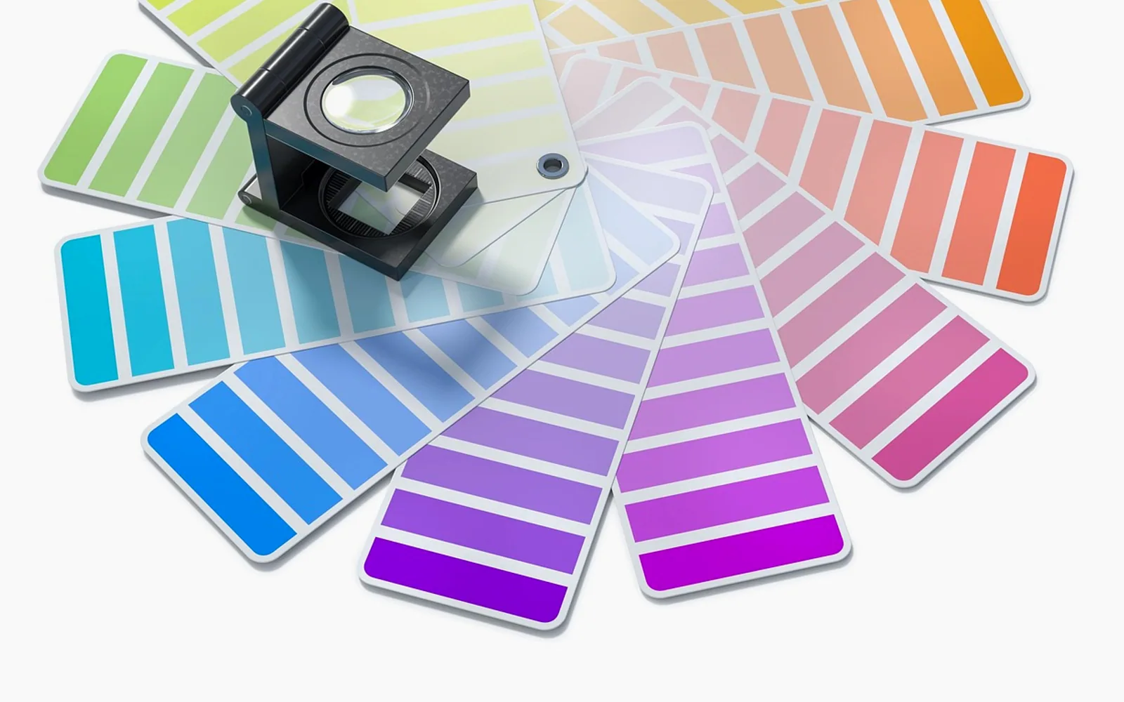
List two or three main colours and a few supporting ones. For each, give the hex code for websites, RGB for screens and CMYK or a spot-colour reference for print. Add a note on proportions, for example "mostly cream and charcoal, with the orange kept for buttons and price tags", because a palette used in the wrong balance can feel like a different brand. A quick contrast check for text on each background belongs here too.
Typography
Name one font for headings and one for body text, plus a safe fallback for situations where the chosen fonts are not installed, such as emails or shared documents. Show a short sample of each in use, with sizes for a poster headline, a website paragraph and small print.
Imagery
Describe the kind of pictures that fit: natural light or studio, people at work or close-ups of products, warm or cool colours. A few approved sample images say more than a paragraph of adjectives. Portraits deserve their own rule, since a team page with mismatched backgrounds and crops undermines everything else; the approach in keeping headshots consistent across a team slots neatly into this section.
Voice and tone
Words are part of the brand as much as colours. Three adjectives that describe how you want to sound, a short list of words you use and words you avoid, and a before-and-after rewrite of a typical sentence make this page useful rather than decorative.
Three sample entries
To make the sections concrete, here is how three very different businesses might fill in a few lines.
A neighbourhood café
- Brand summary: a relaxed weekday breakfast spot for people who live and work on the street.
- Colour: oat, espresso brown and a single tomato red reserved for specials boards.
- Imagery: overhead shots of plates on the wooden counter, morning light, no stock photos of coffee beans.
- Voice: chatty and short; menu descriptions name where ingredients come from.
A local plumbing firm
- Brand summary: reliable repairs and installations, explained clearly before any work starts.
- Logo: single-colour version approved for van livery and work shirts; never placed on photos.
- Imagery: real team members on real jobs, tidy work areas, customers' homes only with permission.
- Voice: calm and practical; quotes always state what is included.
A small design studio
- Brand summary: identity and packaging work for food and drink producers.
- Typography: one serif for headings, one sans-serif for text, both licensed for web and print.
- Templates: proposal, invoice and case-study layouts kept in a shared folder.
- Voice: confident without jargon; case studies describe the client's problem before the solution.
Where the guide gets used
A guide is only worth something if it is opened. Link it from the places where design decisions actually happen: the shared drive, the onboarding checklist for new staff and the brief you send to printers or freelancers. When you prepare material for journalists, the logo files and photos in a small-business press kit should be the same approved versions the guide describes.
It also helps to connect the guide to your planning. If the yearly one-page marketing plan includes a new product line or a seasonal campaign, check whether the guidelines need a matching addition before the work starts, not after.
Common mistakes
- Writing it once and forgetting it. Review it every year and whenever the logo, a colour or a supplier changes.
- Making it too long. A thick document nobody reads protects nothing. Put the rules people need daily on the first pages.
- Rules without files. Every rule about a logo or template should link to the file itself.
- No examples. "Friendly but professional" means different things to different people; a sample sentence settles it.
- Treating it as law. Leave room for judgement on one-off jobs, and update the guide when a good exception turns into a habit.
Start small: a summary, the logo files, the colour codes, two fonts and a few lines on tone. That alone will make the next flyer, website update and shop sign look as if they came from the same business.
Got a topic idea?
Corrections are always welcome.
Margin note
Read this before acting on anything here
Our articles describe how marketing and business money generally work. Your trade, your town and your accounts will add details no general guide can see.
For decisions about investments, tax, contracts or legal duties, please talk to a qualified professional who can look at your own figures.
The four writers of this notebook
Marketing & Sales
Same topic
3